
 |
| Written Brief |
I began by doing some research into cats and their habits as this would give me an insight into what would be the most appropriate things to produce (See Kitty Collateral Research Post).
After this, I went onto thinking about the cat brand itself. I had already established from the brief that the company I was going to produce a brand for was going to be a start-up cat company so it was a case of coming up with the brand name from there.
 |
| Brand Brainstorming |
The name that stood out to me out of all of the words that I came out with was the word 'Mau' after the Egyptian word for 'cat'. This stood out to me, not just because of the grandeur and the status that cats had, but also because it is similar to the 'mieow' sound that a cat makes when they are communicating to humans. This gave me the brainwave that this would be a great marketing ploy for the brand because that way, every-time the cat would talk to the human, it would be promoting the brand name.
 |
| Brand Planning and Initial Sketches |
I moved onto making the initial sketches that I had done for possible logos and putting them into Illustrator.

 |
| Initial Typeface Attempts |


 |
| Initial Cat Experimentation Illustrations |
Seen as I was struggling with the font, I decided to have a play around with making some cat illustrations. I had a go at producing a range of different shaped bodies and heads as well as experimenting with developing features and detailing for each face. I managed to pick an oval shaped body with a rounded face and heart shaped nose so that it was very cute and easily relatable character reference.
 |
| Initial Logo Development |
 |
| Klinic Slab Typeface |
 |
| Cat in the Logo |
 |
| Simplified Logo Versions |
 |
| Best Logos |
 |
| Chosen Logo Experimentation |


 |
| Logo Development |
 |
| Colour Choices |
 |
| Application of Colour Scheme Possibilities |
For experimentation, I decided to apply these colours to the current working logo to see how they would look as a brand.
At this point, I had a tutorial where I discussed the current briefs that I have been working on (See Extended Practice Blog).
 |
| Tutorial Notes and Brainstorming from Tutorial |
From this, I brainstormed collateral that I could produce that was relevant to the context of the brief, such as collar and luggage tags for guests, toiletries, a brochure and treats alongside corporate identity collateral, like stationary and a website.

 |
| Cat Hotel Logo |
Following on from my logo indecision earlier, the fact that the context has been decided for the brief made it feel much easier for me to pick a logo that I felt was appropriate. I felt that going for a more type based logo with a simple silhouette at the top would allow for a sophisticated brand which you could imagine on top of a sign of a stately home. The small silhouette gives some visual context to the brand while the colour scheme reflects the colouration of the cat illustrations, sticking to neutral colours in light yet warm hues.
Also, the positive feedback that I got from my cat illustrations pushed me onto developing them so that I could maybe include them within the brand identity of the Cat Hotel.


 |
| 8 Cat Character Illustrations |


 |
| Pattern Experimentation |
I felt that the characters that I had produced for the hotel would make for a very cute and engaging pattern that could be used for the brand. I started experimenting with placement and size of the characters by changing the directions of the characters so that they were like different styles of walls. Despite doing this, I felt that it was the best when the characters were the right side up and slightly alternated so that it gave a subtle variation throughout without having the same cat being next to each other.
 |
| Mau Colour Scheme |
From the illustrations that I had done, these helped me determine and finalise the colour scheme that I was going to use for the brand, in keeping with the natural colours of fur and giving a warm and homely feel.
 |
| Collar Tag Initial Drawings |
Using these colours, I began to play on some initial layouts for some collar tags that I wanted to have for the guests staying at the cat hotel. Despite this, I felt that they were cluttered and were not sitting right with the information for each room.


 |
| Packaging Initial Idea |
At this point, I had two crits, one after each other so I was able to get feedback from where I am now with a solid brand identity and context behind my brief (See Extended Practice Blog).
The first crit I had was a student- led crit where I asked about my colour scheme because I was worried about it being too pale, however, they thought it was actually a very nice and subtle colour scheme which made them think of natural fur colours so that was successful in that sense.
The second crit saw me talk about my brief but, when discussing it, had people question the name of the brand, not understanding it and not liking the typeface. I got the comment that the name of the brand was difficult to understand and that the 'Klinic Slab' font wasn't at all fitting for the need of the brand. To me, it makes perfect sense yet, I guess that if I have possible customers not being able to understand it then I would have to go back and change it all.


 |
| Changing the Typeface |
I decided that I would try and rectify the problem by changing the font that I had for the header of the logo yet however many fonts I tried to use to improve the actual logo so that it was more obvious or understandable, the more it just wasn't working out.
It got to the point where I decided that the only way I was going to be able to sort out the problems that arose in the crit was by scrapping everything that I had done so far up to this point and starting again, beginning with a new logo and name.
 |
| Name Brainstorming |
I began by coming up with possible names for a cat hotel, thinking of quite witty puns and play on words for a brand name from culture references. It was only when I was looking at words that could mean to be well off that I came up with the word 'Aristocat' as a play on words for an aristocrat. I thought that this would be a perfect name for a cat hotel and would mean that I would automatically have a tone of voice and audience for the briefs new direction. The tone of voice would be of luxury and dedication whilst the audience would be well off families and holiday makers who wanted the same for their pet.


 |
| New Brand Logo Variations |
With the concept and name of the brand thought of, I went onto producing a new range of logos for the new brand cat hotel. I took the mixture of having the cat head icon from the previous logo for context and began to play with it. For the logos I played around with imagery like paws, houses and cat flaps to give the right impression of a place to stay yet I developed a new icon of a cat head wearing a top hat and a paw monocle so that it gave the impression of a classy and luxurious place to be. I began to apply this icon to the name of the brand logos that I was producing whilst using the fonts 'Governor' and 'Nexa Light' to give a softer authority to the logo.
 |
| Chosen Logo |
Out of the logos that I had created, I really liked this one as it was very simple yet I liked the fact that all the information in the logo was enclosed within a circle so it would be similar to that of a stamp. Also, I felt that, by just using the icon that I had been playing with, it would make for a unique identity whilst not being too overbearing by the amount of cat ephemera.

 |
| Colour Variations and Chosen Colour |
 |
| Comparing new logo with old illustrations |
I still had the illustrations from the previous brand which I loved but I compared the two together and I felt that they just didn't work well together as the new brand was a bit more serious and sophisticated which just didn't fit alongside the illustrations. I knew that, in order to make sure that the tone of voice was succinct throughout, that I was going to have to get rid of the illustration for the benefit of the brief. This was difficult for me as I had got really attached to them and had my heart set on using them but I knew that this would compromise the overall cohesiveness and the message of the new brand.
Collar Tags
For the hotel, I thought it would be a lovely idea to have names for the different suites that the cats could stay in.
 |
| Planning of Hotel Names, Products and Sayings |
Using references to cats in everyday culture, I came up with the names of 'The Fat Cat Suite', 'The Cat's Pyjamas Suite', 'The Cat's Meiow Suite' and the cat who got 'The Cream Suite'. I thought that these little details would give more personality to the hotel.
 |
| Collar Tags for Aristocat |
I had previously tried to design some collar tags for the hotel with the previous identity but it didn't work very well. I had another go using the new identity and it was much more fitting and simple, suing the circle of the logo to determine the shape of the collar tags. Also, I mixed the header and tagline fonts to create a visual hierarchy of information. I was very happy with how these came out and I am going to continue to show the hierarchy of information in this way to put emphasis on what is and isn't important.
Website
From this, I took an unusual direction and decided to produce a website for the brief. I wanted to take the opportunity to come up with a web design as this is something that keeps coming up in portfolio crits I have with studios as well as being something that I haven't worked on this year and would like to give it a go. Seen as I now had a new brand identity, this seemed like the best time to give it a go.
A website would be appropriate for the brand because many customers for the hotel would probably not live in a close vicinity of the hotel itself so it would make it more convenient when trying to make reservations for the hotel and finding information about it.

 |
| Planning for Website Content and Layout |
I began by planning what pages I would need for my website. I felt that the pages that would be relevant would be an accommodation page, a facility/ treatments page, an about page and a contact page. For this, I thought about little details that I could add to make the website more bespoke, such as paw-prints for the mouse, a house for full rooms and a filling up food bowl for a load screen.


 |
| Initial Page Layout |
I started off by coming up with a generic layout that I could use to apply to all of my pages. Initially I liked the idea of having all the page information on one side but I found that it didn't line up very well so I decided to put them in the middle centred which sat better.


 |
| Content Planning |
The next thing I planned was the space as to where I was going to have the information. As the page was currently quite stark and white, I thought that it would be good to have a large sized image as this would make up for the amount of space. Initially, I wanted to have a text box to the side of the images yet I felt that this wasn't very suitable for a homepage and I couldn't guarantee that there would be that much information for each layout for this to be applied to every page therefore I decided to stick with just one image.
 |
| Inverted Colours |
I tried the colours inverted as I felt that the plain white was a bit bland but the inverted colours looked hideous.

 |
| Information Stamps |
So as to advertise the services of the hotel, I decided to have little stamps that I could apply to the website which would have information in them that customers could use as links. using a similar hierarchy to that of the collar tag information. For the linked bits of the information, I added a smaller circle to the corner so that users could clink onto it to get to the direct bit of the website they needed.
 |
| Applied to Homepage |


 |
| Paw Prints for Mouse Tester |

 |
| Paw Prints Roll Over Button |
 |
| Accommodation Page Layout |
As there are 4 different suites to the hotel, I realised that I would have to split up the large image from the homepage into four. I realised that, to be able to access the information about each room, it would be easier to have the photos act as rollover buttons which reveal information about each room. With that, I added a contextualised stamp to the middle of the page so that the user knows what is happening for the page.


 |
| Rollover Button Photos |
The next thing I realised that would be relevant would be to have a method of being able to book rooms for the hotel online.

 |
| Loading Screen |

 |
| Rooms Available Calendar |
 |
| Sizing and Placement |


 |
| Loading Screen in Action |
 |
| Calendar in Action |

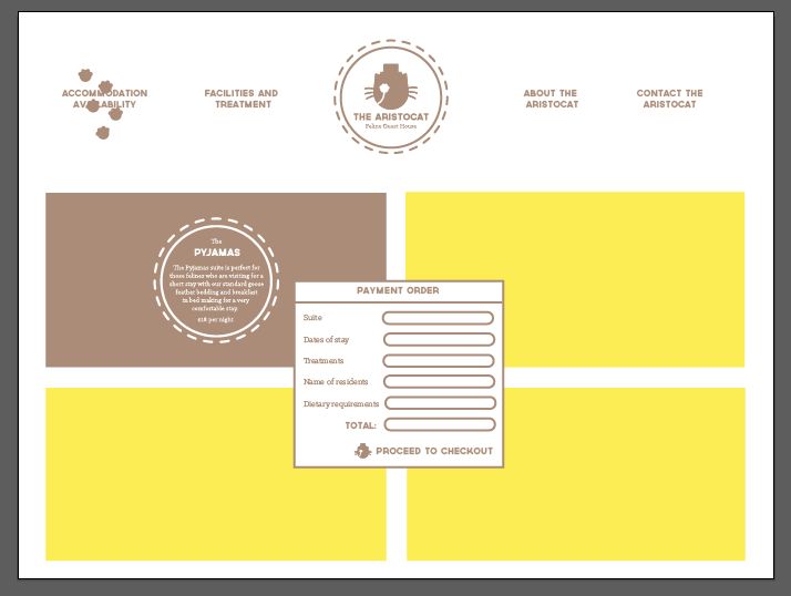 |
| Payment Screen |
Following on from this layout, I applied it to the rest of the pages.

 |
| Facilities/ Treatments Page |

 |
| About Page |
The about page is the same as the homepage with just one large image yet with a rollover button for information to the user.

 |
| Contact Page |
From the layouts that I had done, I took them into Photoshop and added in the photographs that I found of cat hotels from my research.

 |
| Making the pages in Photoshop |
I took the sizes that I would need for the images and put them into Photoshop. I transferred all of the different elements oft he web page from Illustrator to Photoshop and built up the web page by using layers and smart objects. This is something I hadn't done before and made it so that I could try and make everything consistent for each web page.

 |
| Homepage |

 |
| Accommodation Page |


 |
| Loading Screen |

 |
| Calendar and Payment Method |

 |
| Facilities and Treatments Page |

 |
| About Page |

 |
| Contact Page |
For each of the other pages, I added the brand colour filter to the roll over buttons and applied their own information stamps to the pages so that they were all individual whilst keeping the character of the brand.


 |
| Website Mock Ups |
Postcard


 |
| Postcard Design Attempt |
I started with a postcard design because I thought that I could make it link to the website layout. Saying that, when I was designing it, I didn't feel like the layout was working for a printed setting. I just wasn't convinced and I didn't think that it was giving the right impression for the brand. I decided to scrap the idea of having a postcard because I wasn't convinced that it was adding anything to my hotel brand.
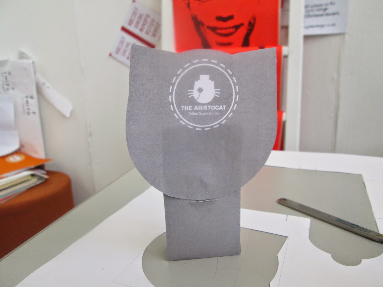
Cat Flap Hanger
I decided that I wanted to focus on making something that would be individual to the hotel itself so I thought I would focus on making a cat flap hanger.


 |
| Cat Flap Hanger Shape |
I thought that traditionally, you would have a do not disturb sign at a hotel, so I thought it would be bespoke for the clientele to have a do not disturb cat flap for cats who have gone to sleep and do not want to be disturbed. Initially, I went for a traditional shaped cat flap but then I found that it would be different to have a circular shape to fit with the brand logo. I soon realised that, by using the round shape, it looked like the behind of a cat with its tail curling around the hanger. I thought that this would be great for the guests of the hotel and decided to run with it.


 |
| Cat Flap Hanger |
I added some text in the same way that I had done for the website where I had some information in a circle and added it to the middle of the hanger, using a cat saying to give the message necessary for the hanger. I tried to add the logo onto it at the front but it just wouldn't fit properly onto it so I added it to the back of the hanger so that it could always be turned around when not in use.
Welcome Mat
From the visual design of the cat flap hanger, I applied the same visual to a welcome mat.
 |
| Welcome Mat |
I felt that, with the guests being cats, they would make a habit of coming in and out of the grounds of the hotel so it would be a nice touch to have these mats that they can walk on before they walk into the hotel. I added a witty cultural reference about cats onto the mat and put the logo in the corner as there would be no point having a logo for a cat mat on the back as it wouldn't be seen.
Business Card
Moving onto a serious side of the cat would be to produce some business cards for the business.
 |
| Initial Business Card |
For a business card, I took a very simple layout of the card, making it full colour with a white logo. With this, I added the contact information from the website onto the back of the card so that it was a very simple yet straight forward approach to the brand.
 |
| Comparing the Two Backgrounds |
 |
| Chosen Business Card |
I felt that having the business card with a white back made for a luxurious aesthetic and a clearer, readable business card. Sometimes, I need to realise that less is more as this comes across as more fitting to the needs of the brief.
Toiletry Labels
From this, I began to move onto the packaging aspects of the products for the hotel, starting with some toiletry labels.


 |
| Toiletry Label Tag Testers |
For the brief, I wanted to produce some packaging for some toiletries which initially were going to be a small gift set with some bottles in, however, now that I have the context of a cat hotel, I thought that this would be a really cheap and tacky thing to have for a hotel setting. Therefore I decided that I wanted to have some jar bottles, similar to that of a spa, that would be used to drizzle shampoo and oils onto the cat so that it was classy and sophisticated.
To be able to label which bottle is which, I knew that I wouldn't be able to put a sticker over the bottle as this would take away from the luxury appeal to the brand. I decided that the best solution would be to have a small label for the jars that would be attached to the jar. I wanted it to be round so that it was in keeping with the brand logo.
I had the idea of having the label as a small booklet but I didn't know if this would be too much so I also did a small double sided label as well. I decided to do a little mock up for each one to see which one visually looked the best. I personally felt that the booklet label gave more of a quality impression so I went for this one.
 |
| Information for Toiletry Labels |
I created all of the information that would be necessary for the labels, including directions for the use of the products and some of the contents of the ingredients.
 |
| Initial Outside Design |


 |
| Booklet Style Labels |
Added to this, I went onto producing the inner bits of the labels which included the suitability of the product and the directions of use. This would make for a very comprehensive label design with a lot of information on a small scale.
Treat Packaging
Having worked on the toiletry packaging, I moved onto the treat packaging.
 |
| Initial Box Idea |
From the beginning, I liked the idea of having a cats head as a top for a treats box but I wasn't sure how I was going to make this happen.


 |
| Initial Packaging Tester |
I started by making the net for a normal box to see whether it would work, which i found that I just needed to cut down one extra side. I realised that I couldn't have a head attached to the net to fold over because, if I wanted the cats ears to be stuck up, it would not work. To attached the cats head, I knew that I would have to do it separately to the packaging itself. To see which would be the most supportive way of having the head on the box, I decided to see whether it would be best to have a head on just one side or whether I could have two heads attached together. I found that the double head didn't work very well as the box wouldn't open properly so I knew that I would have to have just one head on the front.


 |
| Improved Packaging Tester |
I changed the packaging to get rid of the extra side, but also I made the box narrower as the last one was unneccessarily wide. I realised that I was going to have difficulty closing the box by having a cat head on the front so I decided that it would be nice to have a front that could easily slip into the front panel. I cut into the front to allow for the head to slip in but it didn't look right. Therefore I realised that it would look better if I had an extra piece of card where I could slip the card into and hold it closed. Also, by having a rounded piece of card, it would look like the tongue of the cats head which would add to the visual effect of the packaging.


 |
| Final Packaging Net |
From the tester mock ups that I had been working on, I made a final net for the packaging that worked. Also, I decided to focus on having just three flavours of treats so that it would make for a specific range.
 |
| Final Packaging Tester |


 |
| Coloured Heads for Treat Favours |
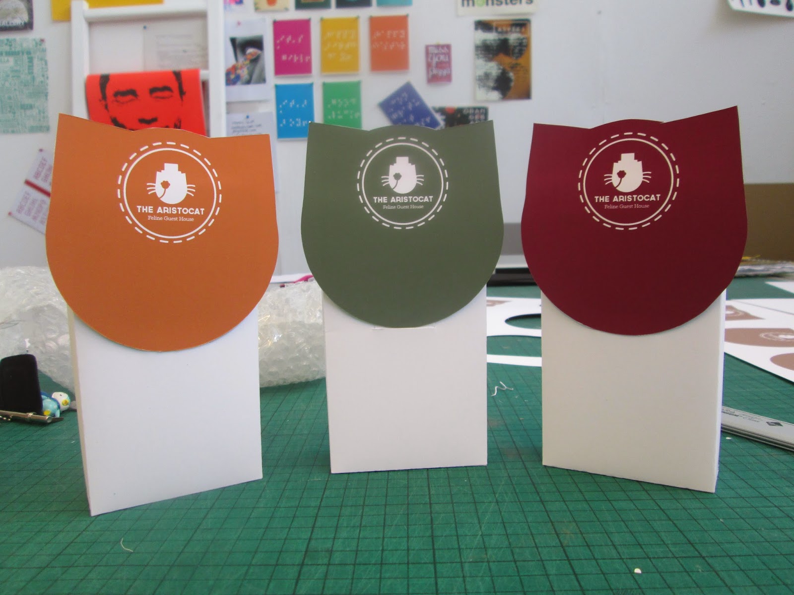
I decided to apply some colour to the brand by selecting a colour for each of the flavours. The colours I selected were chosen for the fact that they are hues which give the influence of being luxurious whilst also giving the impression of being natural rather than being bright or overbearing, in particular, the orange and green which were taken from the original colour scheme of furs and eye colours of cats.
From the work that I had produced, I printed it out onto matt paper and began crafting the components for the hotel.


 |
| Crafting the Collateral for The Aristocat |
What took the most time crafting were the labels for the bottles as they were very tricky to cut out and fiddly to attach. I decided to add a ribbon to the bottles for extra decoration as well as give my labels something to attach to. The treats boxes were difficult as well because I found that I had to produce them without getting it wrong due to the fact that they were white so any mark would show up on the packaging.
From the work all put together, I thought that the work produced was better than the direction that the brief was originally going in. I really struggled with getting all of the components to work together, especially any of the double sided work because, despite how precise they were all lined up, it just wouldn't work.
With all the pieces of work come together, I went onto photographing them so that I could present them in a professional manner.


 |
| Photographs for The Aristocat |
I used a yellow background to give a bright contrast to the dark beige colour scheme and put the images in Photoshop to lighten up the images. The actual range works well together yet I think it would be better if I had some more work in it so that it was more comprehensive as a project. This is something that I can always work to in the future.
With the inclusion of the photographs I had took and the website mock ups, I made some submission boards for the module submission to demonstrate the journey of the brand and how I came to this conclusion.
I feel that the boards that I have produced shows a very condensed yet clear development of how the project progressed.
Initially, I decided to do this project due to the fun nature of the brief and it gave me the opportunity to work on a web design, which is something that I haven't worked on all year. I don't think that this work is the best work that I have produced this year but it is still better than anything I have made in previous years. At times, this brief has been a struggle from trying to respond to feedback but it made my work stronger overall in the end which made it worth it. I was quite impressed that I was able to produce a more sophisticated and luxurious brand identity which is something I do not tend to work with. If I had the chance, I would like to go back to this brief and improve it by working more on the web design aspect, making it more adventurous and dynamic for a better user experience and perhaps go into more detail with the product range but overall, it was a fun brief to do based on a personal interest of mine and would allow me to have something that would give a great talking point in my portfolio.
No comments:
Post a Comment