
 |
| Victoria Shakes Band |
They are a small, local band who have recently started playing gigs together, with their main focus being on weddings and sometimes other events.
 |
| Written Brief |
I was really excited at the prospect of doing a live client brief as I haven't really had the chance to do one yet. Also, I felt that this would be a great chance to have a go at trying to work on my timing for a brief, as discussed when I went to my studio visit at Tonik. Not only that but I tend to always work with large scale briefs as that is what I enjoy so doing something on a small scale is different for me.
 |
| Initial Sketches |

 |
| Chosen Typeface |
From the initial sketches, I started by choosing a typeface that fitted the clients wants. The visual needed to be classy yet I didn't want the typeface to be overly done so that it was still readable. A lot of the ones I tried were clumsy or naive which didn't fit the profile of the client yet 'Cylburn' was sophisticated and legible without being too over-bearing.

 |
| Colour Choices |

 |
| Colour Scheme Applied |
To be able to see what each of the colours would look like in practice, I started by making a very simple logo and then applying the different colour tones to the logo. I did this by alternating between a solid colour background and a solid colour font to see what effect would look the best.

 |
| Colour Scheme |
The colour scheme that I found the best was a pale navy blue, however, instead of a white, I deviated from the wanted colour scheme to go with an off-white/cream colour which I felt gave a bit more warmth and sophistication to the visual identity.
Following on from the font and colour decisions, I went onto producing logo variations for the band.


 |
| Original Logo Designs |
I started by keeping the logo variations very simple, solely working on just the name of the band and the circle itself, trying to find ways of creating a relationship between the name and the circle and how to connect them together. However, I didn't know if these came across as being a little bit simple. I decided that I needed to try and create more detail so that they had more personality to them.


 |
| Logo Experimentation |
I developed the logo with the ideal that it should be traditional and classy so that it would be something that would instantly be synonymous with the aesthetic of a wedding. That way, the logo would communicate the function of the band and would give the indication of the audience to use them for their wedding. Despite this, I feel like I am loosing the essence of the logo which is essentially a band logo so I want to go back onto developing some logos which are more representative of the band itself.


 |
| Logo Development |
I selected the logos which I felt so far had been the most successful and decided to develop them so that they were more focused towards being for a band. I felt like these were more successful as they had more of a personality to them and the fact that they are all enclosed within the circle gives a more intimate visual.
To present what I had done to the client, I produced some design boards with the range of what I had produced.
This way, it would be clear to the client what I had produced and they would have a range of different styles to chose from.
 |
| Chosen Favourite Logos |
After showing the client, they were very happy at what I had produced and had whittled down their favourites to two. The first one being a very classic, simple logo with the other looking like a record player.

 |
| Typeface Changes |

 |
| Typeface Experimentation |
What the client did ask for as an amendment, however, was the first letter 'S' in the word Shakes was too difficult to read so they wanted it to be more like the one at the end. I stated that this would probably not work on the visual but I would produce it to see what it would look like. I decided to produce a range of variations of the S on the two favourite logos. I left one as it was, a lowercase 's', an enlarged lowercase 's' and a manipulated enlarged lowercase 's'.
 |
| Variation Presentation for Client |
I presented the logos for the client so that they could see the differences between the 's' and how they change the presentation of the band. I also advised them on the inconsistencies of using the lowercase 's' with the weight distribution.
 |
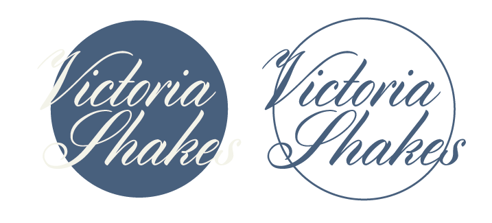
| Chosen Logo |
In the end, the band decided that they would go with my judgement and went with the original lettering, as well as selecting the classic simple logo as it would aid the legibility issues. I was very happy with the way that the logo came out as it looks professional and answers the needs of the band.
To present the way that the logo could be used, I made a few mock ups for the band to show how it could be used in context.


 |
| Poster Mock Up |
I designed a simple band gig poster on Illustrator and put it into Photoshop to present as a actual tour poster.


 |
| Drum Kit Mock Up |


 |
| Tour Van Mock Up |


 |
| T Shirt Mock Up |
With the inclusion of the mock ups I had made, I made some submission boards to demonstrate the journey of the brand and how I came to this conclusion.
I feel that the boards that I have produced shows a very condensed yet clear development of how the project progressed.
This brief was great for me because it allowed for me to get some experience in a client brief scenario and also allowed for me to make a quick turnaround for a brief. This is something that I needed experience in, especially to get quicker at making work and I am quite proud of myself as I was able to achieve something that was of a high standard. I wanted to take on board what had been said to me during the studio visits and put it into practice and I think I have managed that.