This student-led Crit was run by just a small group of us as we felt that we get the best quality feedback from just a small group of people being fully engaged within the Crit.
We went around the table and discussed the problems or indecisions that we had with the projects that we were currently working on and asked questions of the group in relating to the feedback that we specifically wanted.
Idea Development for YCN
The main thing that I asked about for my crit was the idea that I have for the YCN Save the Children brief. I had briefly spoken to Amber in a progress tutorial about my idea but I wanted some feedback from my peers as well.
I wanted to know if I was justified in answering the brief in the way that I was in the sense that I am not using the branding guidelines provided at all. Those in the crit felt that my idea was very strong and it was a different approach to answering the brief backed up by the research undertaken and provided by Save the Children.
Initial Character Development
Also, I showed the characters that I had started developing at this point and asked about where I should go with them. The group stated that the father and son needed development as they don't come across as friendly, relatable or believable which I agreed with and asked for their opinion in what I could improve on. They said that I needed to get rid of the beard and change the hair of the boy so that they are softer and less serious or cold.
In regards to my Kitty Collateral brief, I asked about the colour scheme that I had selected as I wanted to know that it was appropriate, I was worried that, because it is mainly beige and neutral colours, it would come across as boring or too pale. The feedback I got was that it was about right as it was warm, inviting and, most importantly, homely as well as being a reminder of the cats fur coating.
This crit came at a good time because I needed this reassurance and reference in order to build on my briefs and continue to develop them which the feedback that I have got has really helped in allowing me to move forward.
This live brief set for us by the Design Business Association, the leading business association that is involved with regulations within the design industry.
DBA
The brief is to brand an identity for the 'Northern Powerhouse' and create awareness for the attributes of the cities of the North of England who are involved.
Highlighted DBA Brief
We have already been given the name of the brand, 'Capital North' but we have to produce the visual identity for the brand, encompassing the 4 cities involved; Leeds, Liverpool, Manchester and Hull. The mandatory requirements for the brand identity is a logo and a series of 4 posters, one for each city. Alongside this, we must produce 2 further pieces from the given list; Train Livery. Train Staff Uniform, Taxi Livery, Environmental or a 'What's On' App. We have to get into groups of either 4 or 5 and give a presentation at the end, explaining the brand that we have produced.
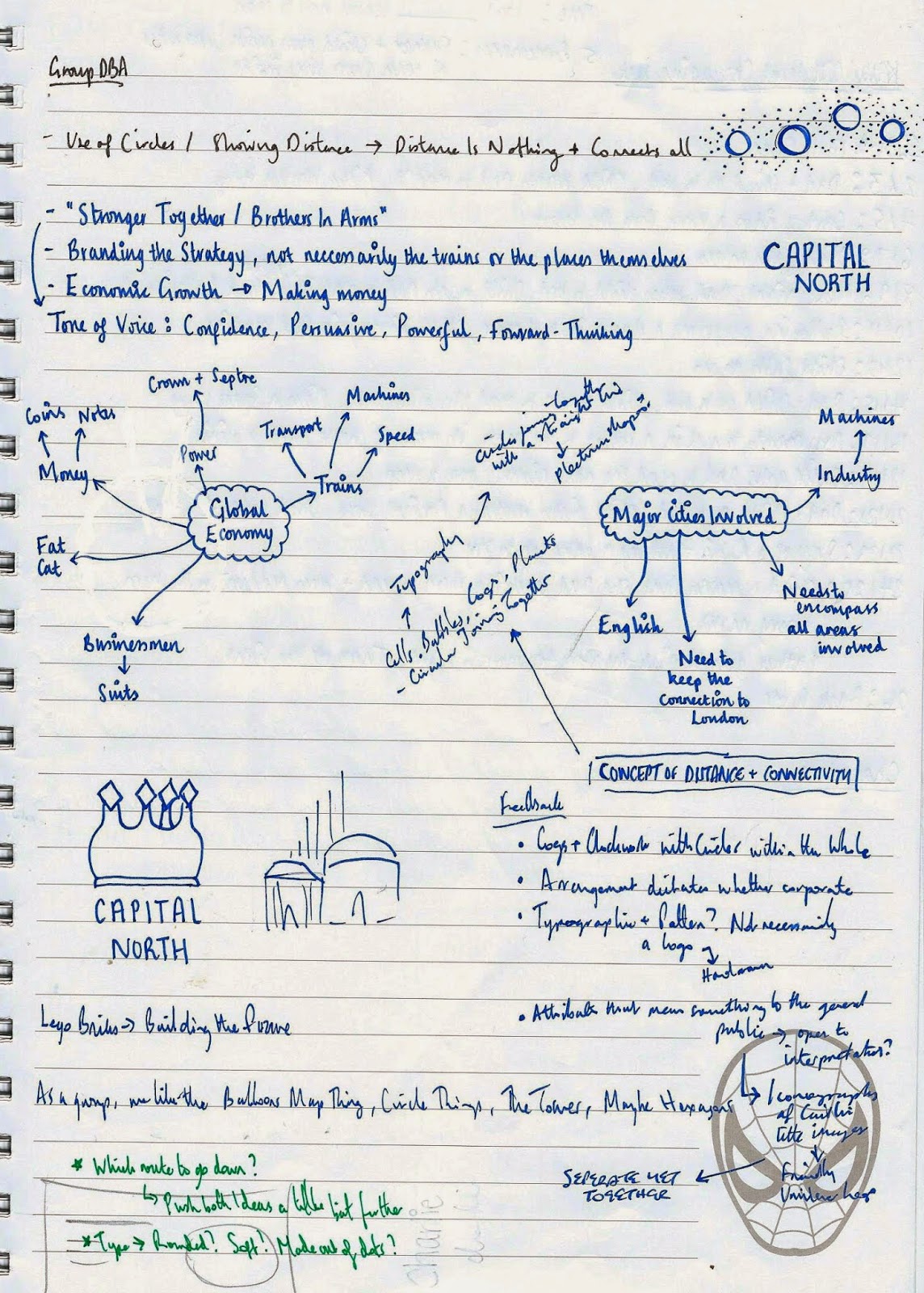
Notes from Briefing
For my group, I am with Grace, Adam, Caitlin and Mel G. I have never worked with Mel or Adam before whereas I have worked with Grace and Caitlin in a group brief before and we worked very well together so this way it gives me a great balance. Adam would be on placement for the first two weeks of the brief so we would have to work as a group of four until he was back but we knew that he would help as much as he could whilst trying to juggle placement duties.
Research Decisions for Group
To start with, it was decided that we would research into 1 city each so that we would split the research up fairly and then meet back together again so that we could talk about what we had found out and start coming up with ideas. I was given the city of Leeds.
To start with, I thought I would have a quick look at the details of 'The Northern Powerhouse'
'The Northern Powerhouse' refers to a new train railway line that is being proposed to try and connect the east and the west of the north of England together. Dubbed the 'HS3', it intends to give a connection to 4 main cities so that travels times are reduced to help speed up business links. The intention is to make the 4 cities act as one, making the cities which are close to each other be connected. A similar thing had been tried in the Netherlands and was successful for the economy so this replicates something that has already been tried and tested in other countries.
'We're Building A Northern Powerhouse' by H M Treasury
The main reason for the need for the 'Northern Powerhouse' is to create a better balance of power and economic growth as, currently, London at the bottom of the country, is the largest stimulator of money which makes for a really bad imbalance. By investing a large amount of money into the transport system as well as strengthening the cultural aspects of the cities, the idea would be to use this money to invest in the city and re-invest it.
"George Osbourne Speech on HS3 and Northern Powerhouse" by BBC News
liarpoliticians2 (Originally BBC News) (2014) "George Osbourne Speech on HS3 and Northern Powerhouse" [Youtube] 23rd June Available from https://www.youtube.com/watch?v=1e4TQfa1hX0 (Accessed 4th February 2015)
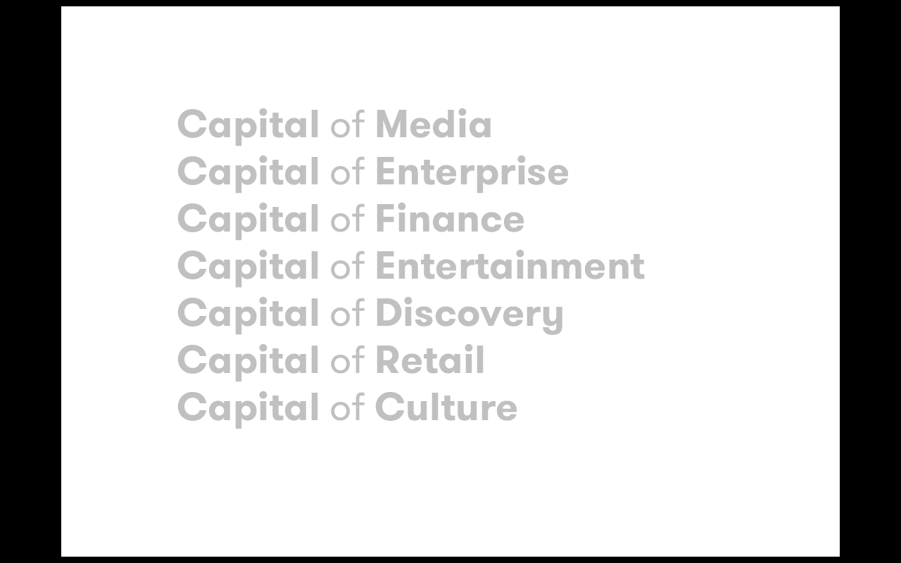
George Osbourne, the Chancellor for the Exchequer, gave a speech when the plans for the Northern Powerhouse were unveiled, pointing out several reasons why we need a Northern Powerhouse and pointed out 4 main areas why the north should be considered alongside London itself, commenting on transport, science and innovation, entertainment and power. He makes a few valid comments and these are definitely aspects that should be considered when we come up with ideas for the way that we present the north.
On my walk to the train station, I decided to photograph landmarks of Leeds that I would pass on my way.
Photographs of Leeds Landmarks
The main things I noticed about the landmarks I passed was the grandeur of the buildings and how sculpted they are. What interested me the most was the Civic Hall building, designed by Vincent Harris, a white building with gold owls and a clock. I felt that this was a very interesting element which would be good to follow up. I wanted to know what the significance of the owl was.
The owls on the Civic Hall building reflect the crest/ coat of arms of Leeds which belonged to the first MP of Yorkshire, Sir John Saville, who was originally from France and brought his coat of arms over to Leeds which is where they come from. This has been adopted throughout the city as the main symbol and there is even a walk that you can follow around the city centre to be able to spot all of the different owls that adorn various buildings of importance within Leeds.
As a city itself, Leeds is the 3rd Largest in the UK and has a population of 757,700. It was known for being a large part of the Industrial Revolution, described as being 'the city that made everything' due to the amount that would be produced, especially for its speciality of Woollen Cloth. The original name for Leeds as a Roman settlement was the latin 'Loidis' which is believed to have meant 'people of the flowing river' due to the position of the River Aire. Leeds still holds its status as being a mainly industrial city however it has grown to become one of the largest cities in the UK, especially from the growth it has had in the economic sector.
Following on from the basic research, I realised that there are many different components of the city itself and, if this is the case for the rest of the cities that the rest of the group have researched, the this is going to cause a problem in regards to trying to find a connection.
I decided from this to start coming up with some concepts and ideas of my own so that I would be able to feed this back to the group.
Initial Ideas
Initially, I started thinking of how I could combine the actual places themselves, beginning with just having them as points that would simply join up. However, this seemed way too obvious and unimaginative. Following this, I thought maybe to look at the geographical placings of the cities yet this would be difficult to replicate clearly and would take a lot of layout work.
The main concept I managed to come up with from my initial ideas was the concept of the saying 'Heart of the City'. I liked the idea that the HS3 train would be going through the centre of each city with its tracks going through and reaching each section of the train stops. This gave the impression of how a heart and blood would act in a human body and made me think of how the train would be acting in a similar fashion. Not only this, but the actual idea of making the HS3 come across as something much more humanistic would allow for an emotional connection to the system, playing on a traditional saying.
Initial Idea Development
For this idea, I started doing some small sketches for ways we could incorporate the North within a heart shaped format which I moved onto trying to produce digitally. I liked the concept of trying to put the different shapes of the cities into an integrated heart but I knew that it would be far too detailed. From this, I moved onto trying to add an arrow or four points into a visual logo and having the name of the brand itself as a separate part of the image. This seemed to work much better and give a cleaner visual.
When it came to showing the initial ideas that we had, the group didn't like my concept but they liked the font that I had used and the way that I had used a lighter and bolder case together to give more of an impact and definition.
Grace's Approach to Geography
They also collectively like the approach that Grace had taken, where she had looked at geography and showing the spaces and places of the cities, using graphs, mathematics and topography. As a group, we tried to expand on these elements.
Logo Idea Development
I went for an approach to the logo by producing a bar chart using the length of distances between the cities and showing it in a graph pointing to the north. Saying that, this wasn't very individual or different so I decided against it.
Topography Shape
Another member of the team came up with this shape as a way of representing the entire area that the Capital North would encompass. We were intrigued by this image and felt that it was a very strange image yet this could be something that we could work with.
On the Wednesday halfway through the brief time, DBA came in to see where we had got up to as groups and look at concepts, ideas and logo realisations. They came to our group as a team to see what we had been working on and to give us feedback.
Feedback for DBA
We started off by showing them the topography inspired logos that Grace had been working on, with the use of circles. They liked the circle shapes and that it reminded them of cells and particles as well as cogs and clockwork but we knew that another group was doing that and we didn't want to do the same thing. As a group, we knew that we are not very corporate driven and we didn't want to produce something that would be too corporate yet we were told that the arrangement of the work would determine how we would be presenting the work. We also showed them the work that we had tried to produce for Caitlin's want of a crest to represent the Capital North. They liked the images that we had but they also suggested that we could always have a logo that was just typography or a pattern and not necessarily have a logo so that it would have attributes that are open to interpretation and mean something to the public.
Saying that, we could tell by what they were saying that they didn't like any of our stuff that we had produced so far. We decided to take the element that they had liked which was Grace's circles and decided to run with it to see what we could produce as well as the crest idea that Caitlin had and run with them.
Particle Development
I spent a lot of time coming up with different variations of the particle idea, trying to make circles merge together or work together to produce a unified logo.
Crest Development
We made a lot of different variations in our approach to the bubble/ particle approach yet, again, as a group, we were just not feeling it and we knew that this wasn't the right direction to go in. This also went for the crest idea as we just couldn't get the images to work together. I took the approach of trying to merge both elements together but that wasn't working either.
To put it mildly, the crits and feedback we could have got from the DBA guys could have been better. We were left so confused and deflated by the work we had, we decided that the only way we would be able to bounce back from this was to start all over again and scrap everything we had done to this point. This was a tough call because we had put a lot of effort in trying to come up with something but there was no way that we could continue the way we had been.
Notes and Sketches from Group Meeting
We decided to start with a concept or idea that we could work with. The shape stuff that we had been producing beforehand had been working before with the elements of space. We began to talk about space, joking that there is loads of space up here in the North compared to how there isn't in the South, such as with jobs, creativity, business and even parking space! We thought that this would be a nice element to tap into, especially when we had been thinking about geography and how distance is not an issue between the cities.
The team thought that having a logo which would take on the idea of positive space by having this within a logo however, as a team we were struggling to come up with something that used space.
Attempts at logos
I had tried to come up with a logo that looked at working with the letter and forms of the different cities and using the space of that to produce a logo but it wasn't working. I also took the geographical shape and tried to split it up into 4 pieces with the spaces in-between but this didn't work either.
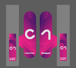
Grace presented us with a logo that her and Adam had worked on together.
Capital North Logo
The logo itself is very simple and comes across as quite corporate but it does give a simple impression for the brand. We liked the simplicity of having an arrow in the middle of the c and the n so that it was like the brand was going to the North and gave a visual accompaniment as to the intention of the campaign, in keeping with the positive space and geography.
Group Decisions
As a group, we decided on the areas that we wanted to focus on in regards to answering the brief and that would be relevant for us and our strengths. We decided that we would focus on environmental factors as we all liked the idea of being able to push the brand and be imaginative with how we would apply it to a real world situation. We also liked the idea of doing the Train Livery as this would work really well with the environment of the cities and how they could work together.
Capital North Concept
Also, we finalised our concept. As a group, we decided to stick to the very open and abstract theme of unity and how the distance between the cities and London isn't a problem as they are all together.
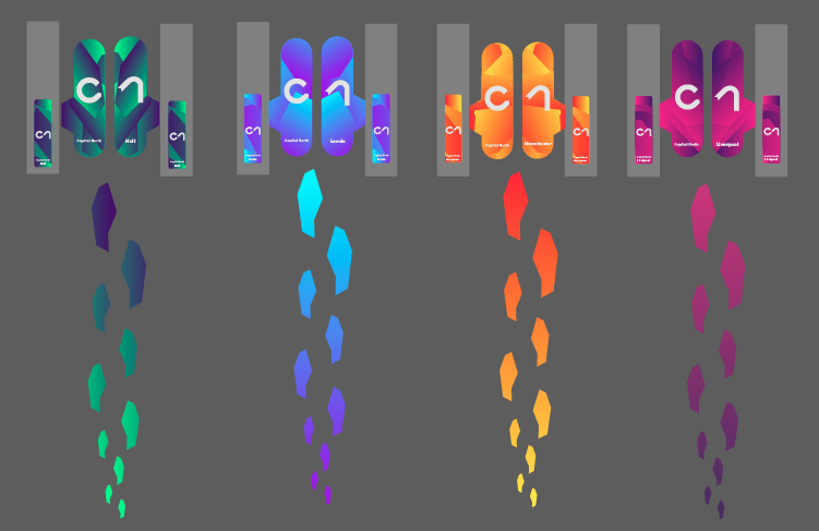
Having liked the logo that Grace had presented to the rest of the group, we decided that we would run with this as the brand logo. However, we needed to try and come up with a colour scheme for the brand.
Colour Ideas
Taking the geography element of the shape that we had liked, I decided to work on a green colour scheme to try and reflect the map design elements of the brand.
Colour Experimentation
I went onto taking some of these colours and trying to make patterns and overlap them like you would with some geographical topography to see how they would look but I was told that it was boring and needs to be brighter and exciting.
Working with the geography angle due to the shape that we were working with, Cailtin had decided to try to overlap a range of bright colours to reflect the topography of a map.
Caitlin's Colour Approach
The group liked what Caitlin had done with the colours as they were bright and uncompromising. Adam played on this by taking the shape of the brand and overlapping it onto the colour background.
Adam's Colour Variants
The group liked the vibrancy of the colours as well as the fact that it was a very open interpretation of the colour scheme. This would go well with the corporate imagery that comes across from the logo so this would work well as it came across as forward thinking and positive for the future.
Logo and Colour Variants per City
From these variants, 4 colours were picked to represent each of the cities as part of their culture or tradition, such as green for the ocean marina for Hull and blue for Leeds for the economy. We liked to be able to show that each city had something different to offer.
List of Aspects for each City
We made a comprehensive list of thing that the North can offer so that we had a focus as to what we wanted to focus the campaign on and show about the North. Amongst our unity concept, this way we could have elements of the North emphasised.
Now that we had a brand identity that we could all agree on and a concept that fitted the needs of the client, we needed to start producing mock ups of how the brand would come to life in a real world situation.
Lists of Stuff to Produce
We got together as a group and brainstormed as many different aspects of transport, travelling and city environment that we could think of. We didn't really split up who was going to do what job but rather, whoever felt that they wanted to do a particular aspect, they could do. What we did do however was narrow the list down to what was important, such as the need for train station livery and environmental aspects. We decided that we would all sit together for the rest of the time and work together on producing the work for the presentation.
Ideas for Environmental Graphics
I had some ideas as to how I could apply the brand and the main idea that I had come up with to produce something for Capital North for was ticket barriers. I commute everyday to college so I knew that, regularly, there is some sort of advertising sticker put onto the barriers on a regular basis, whether that be an event, advertisement or campaign. I felt that this would be really good to have for Capital North to have so that they can have the barriers direct them to the correct platform for where the commuter wants to go so I decided that this is what I was going to focus on.
Shape Footprint
Shape Footprint WayFinding
I had started by messing about with the shape, turning it around and moving it so that I could see how I could incorporate it into my design. I realised that, if I turned it around facing upwards, it looked a lot like a footprint. I thought that this would be a rather interesting take on the brand identity as it would be really good as a way finding system. I made a chain of this shape to create what looked like a series of footsteps which I felt would look really good on the floor of a train station.
Creating Footprints Pattern
Following that, I went onto trying to produce a wave of footprints, creating a pattern so that it was more fitting to the brand. Whilst I didn't think this pattern was successful as the footprints were, I felt that this could be used on the barriers themselves so that the commuter would be able to tell from a distance, which barrier to go through.
Application of Barrier
I decided that I would try the pattern and the footprints on an illustration of a ticket barrier just to see whether this would work. I really like the way that the footprints work but I wasn't completely sold on the pattern itself. It didn't seem integrated and came across as bitty.
Brand Colour Application
I took it a step further by applying this idea to the four colours of the brand identity so that I could see what it would like like in relation to the brand aesthetic. Also, along this, as suggested by a member of the group, I made the footsteps wider so that they looked more natural to someone actually walking to the barrier. This made the footsteps more evenly spaced and less compact. Despite this, I still had the same problem as before where the pattern on the barrier itself just wasn't working. It needed to be simplified and fit better.
Clipping Mask and Gradient
Seen as the brand identity was based on a clipping mask, I have never actually used clipping masks when designing so I had to be taught how they work and how to use one. From this, I was able to learn how to manipulate the shapes so that I could work with the brand identity. I had originally had the gradient on the metal bit of the barriers but this didn't make sense so I swapped it to the gate itself.
Gradient Footprint Experimentation
Seen as the footprints are all going one way and are being shown for way finding, I liked the idea of the colour scheme of the footprints all heading in one direction. Adam showed me a way in which you could get the gradient to work across a multitude of different shapes by dragging the gradient tool across the shapes you want. When applied to the barrier, it made much more sense to the way finding aspect of the footprints as it would get to the different colour the closer you got to the platform. I went onto messing around with the placement of the footprints having them smaller getting larger and larger. I felt that I liked this aspect again as way finding but I preferred the layout of how it was before so I think I'm going to merge the two together.
Developing Shape and Adding Logo
I realised that if I was going to have the gradient as part of the barrier that I should include the logo on there somewhere. I thought it would be good to have the logo of the corresponding city and its colour on the barrier. Also, I changed the shape of the barrier so that it was more realistic to the shape of a real world barrier.
Development so Far
I showed the group what I had done up to so far because I knew that I needed to have some feedback as to how I can improve it and make it more professional. The positive feedback I got was the use of the footprints and the gradient changes was very relevant and they liked the shape of the barrier. Alongside that, they liked the idea of having the logo on the barrier. they said it was in the right direction. They said I could do with making the gradient layered so that it had more of an interesting visual appeal.
The group liked where it was going but they wanted me to make a few changes. They thought it would be nice to have the barrier connections lower down the barrier itself. Also, they thought it would be good to have the logo in the centre, with a letter either side of the barriers. They liked the place name at the bottom of the gate but thought it should be split up so it would have the full campaign name at the bottom on one side and the other would have the city name. Also, they suggested to me to have the logo and city name of the metal barrier next to the gates as the gates tend to open up so this would be hidden from view otherwise.
Changes Made
I made the changes that the group suggested, with the logo split up over the two, newly shaped gates and the logo applied to the colour on the barriers. These changes made for a much more natural looking and professionally presented layout.
Proposed Ticket Barrier Designs
I applied the same visual to the other barriers so that the other cities had a barrier and I believe, that with this design, it is replicating the brand identity of Capital North. I was very happy with how this had come out so I decided to try and apply this to a mock up.
Original Image
Creating a Ticket Barrier Mock Up
I found an image of some barriers and put it into Photoshop before copying every segment that I had designed into the image via a smart object. I was able to change the size of the image and skew it so that the different elements fitted very well on the page.
Saying this, the group decided that it would be better if I just had one city for the barriers because it would make more sense in a train station as you wouldn't have them for different places right next to each other.
Train Barrier Mock Ups
I took their comments and applied the design for just two of the cities so that it was a bit more comprehensive.
I was a bit worried about the mock up because you could tell that they weren't the best mock ups in the world but they had took me a long time and much effort to even get it to this degree. I was worried that the group wouldn't find them very good despite the effort that I had gone to but I was quite proud of myself because I felt like I had finally managed to contribute to the team.
The next thing I went onto producing was some chairs for the trains.
Creating Chair Colour
Adam thought producing some train chairs would be great for me to learn some more stuff on Photoshop. I drew around the chairs with the pen tool and put it onto a new layer which I then went onto painting white. This was painted white so that the colour would show through vibrantly. From the white layer, I added the shape with the gradient and applied it to the chairs, stretching it out to reach the entire width of the carriage.
Blue Colouration
Having used the orange colour first, we found that we didn't like the colouration of the orange so we decided to use the blue gradient which was much stronger.
Addition of Logo
I went onto adding the brand logo onto the chairs by re-sizing and skewing the size, using the white layer technique that I had been previously shown so that the colour gradient for that particular chair would show through, thereby creating the effect as it went down the carriage.
Final Chair Mock Up
I was actually really proud of the finished mock up as it looks convincing and that it could be used in real life. I actually felt that this mock up was on par with everyone else's ability so I was very happy with it.
Whilst I had been working on both of these elements, the rest of the group had been getting on with other mock ups that would be relevant to the brand.
City Landmarks by Grace
Grace was quite focused on getting some of the city landmarks done so that we had a great range of environmental designs incorporated within the cities, highlighting how Capital North is everywhere and all-encompassing.
Transport Methods by Adam
Adam focused his attention on the transport elements of the brand, making use of the chevron arrow for this which was integrated seamlessly into the design, giving the impression of always getting somewhere with Capital North.
Train Station Livery by Mel
Mel did an amazing set of escalators that show how the brand can be incorporated into the transport stations as well as be involved on the modes of transport themselves alongside a range of way finding to accompany the train station inside designs.
Liverpool Environmental Design by Caitlin
Caitlin created some mock ups of environmental graphics in Liverpool, making use of the two logo shapes in different situations. Even though they are very different, you can still see the visual connection between the two landmarks and their relevance to Capital North.
Train Staff Uniforms by Caitlin
To get some more train livery, Caitlin designed some train staff uniform mock ups which use the gradients to give a flash of colour. The colour of the uniform shows the destination that the train is heading in so that you know where you are going when you get the Capital North link.
What was great was that, because we had all been in the studio sitting together, it meant that we could give each other feedback and have quality control over the mock ups that we produced, making for a stronger presentation of our vision for Capital North. We each produced two or three images each which made for an even approach to the workload at this point. Through this exercise, it meant that, despite the struggle I had trying to produce some mock ups, I had learnt a lot about Photoshop and working with images which can only be a positive thing that I can apply to my own work.
Following this, we only had a few other things that we needed to produce mock ups for.
Moodboard by Grace
Poster Designs by Adam
Train Station Way Finding by Mel
Grace wanted to do a moodboard for the beginning and end of the presentation having been inspired by a presentation she had seen on a visit to a expo. Adam worked on the poster for the brand as this is a mandatory requirement and something that we had been previously struggling with but, by using the chevron arrow, became something that was quick and worked for each city. Mel worked on producing some way finding as this was something that we were lacking and what only I had been thinking of within the work produced.
Whilst the group finished what was left of the mock ups, I felt that I would be better use to start working on the ordering and content of the presentation that we have to produce.
Presentation List Order
Completed Pages
I produced a ordering of the presentation that made sense so that the identity would be explained like a story. We wanted the initial pages to be in grey as we wanted to show the identity as a stand along explanation before bringing in the bright colours for the individual places and the application of the identity.
To be ready for the presentation, the group were worried that I would be rushing to get it done if I continued the presentation over the weekend because I had go to my job as well as produce the rest of the presentation. The group decided that they would take what I had worked on so far and continue to build on it. I was a bit worried that it would seem like I would have my work taken over but I respected the decision of the group because it was what was best for the team. From what I had started working on, Grace and Adam took what I had done and expanded on it so that it was more fluid and succinct with more detail.
The only thing that was missing from the presentation was a way of seamlessly going from one section to the next so that our presentation was more concise and professional. I came up with the concept of having a statement on a page stating what section it was about whilst describing the brand, using terms like ' a collective north' to show the visual connection of the brand between each city, 'a connected north' to show the train transport side and 'a united north' for outside the station.
Train Barrier's by Adam
The only problem I had was that I soon found out that my work had been taken out of the presentation and changed, with Adam having worked on it and getting rid of what I had done for the barriers. I can understand that his work looks much better than mine and for the professionalism of the team, then yeah I can completely understand using his work but I was disappointed that I wasn't included as I had worked so hard on it without being told that this was going to happen to my work. I felt that my inability had just been highlighted further and didn't feel like I could match up to the rest of the group. Despite this, I still wanted the team to do well and wanted to focus on the presentation ahead.
The presentation itself gives a strong overview of how our brand can be applied seamlessly through the entire network of communication, both inside and outside the train station, to create a complete unified network.
Notes made for Presentation
We presented the presentation to each of the DBA members, all having a turn at speaking and answering question at the end, having practised several times beforehand and having our notes ready. I got the slides of the visual brand identity and the imagery we used to create the brand.
The feedback we got from the presentation was that out work had come on a lot more since it had been previously seen, especially as we had basically had to start from scratch from the terrible crit we had, and it was something that they could vision as being used in real life. The fact that it was a very simple yet corporate identity allows for an easy application along a wide range of varying areas and they liked that this could be done throughout, professionally shown through mock ups that were consistently of a high standard throughout. As well as the positive feedback, we were also given constructive feedback, such as perhaps doing the posters differently or even getting rid of the topographical shape altogether as it doesn't really add anything.
We found out at the end of the day that our group had won which we were incredibly happy about and that we had each won a placement as being part of the winning team. I wanted to have my placement at Something More and I contacted them to arrange this (See PPP Blog Post). It really goes to show the amount of hard work and determination we had to try and get over the initial problems we had with this brief paid off!
For submission, I made some submission boards for the module submission to demonstrate the journey of the brand and how we came to this conclusion.
I feel that the boards that I have produced shows a very condensed yet clear development of how the project progressed.
This brief was a difficult brief, not just as a team, but for me personally as well, seen as I do not have the strongest Photoshop skills and felt I was more of a burden then a help to the team sometimes. However, I learnt a lot from trying to produce the different mock ups we had so I see this brief as a learning experience i've had rather than being a complete success for me. As a team, we worked very well together, bouncing ideas off each other and pulling everything together which made a difficult brief more bearable. Overall, I think this brief gave me the opportunity to be involved with a corporate branding exercise which is something that I have never done before and was a challenge but ultimately was a good experience to produce work for a new audience and tone of voice.