We found that we were both wanting to do a luxury brand identity so that we could experiment with using foiling within our practice as well as produce a more mature and sophisticated style that we haven't attempted to do before. This is a mutual aim that we want to produce so, with us being on the same page creatively, we felt that this would be something that we could work successfully on as a collaboration.
 |
| Written Brief |
 |
| Initial Brainstorm |
To start with, we did a quick brainstorm of what we felt we could achieve within the brief, looking at areas we wanted to focus on and products we wanted to produce. I like crafting and making packaging whereas Emily likes to produce wide-scale, mocked up campaigns so this would be where our personal strengths lie and can work together to produce something great. We want to produce some brand guidelines that should be adhered to as well as perhaps extend the products we are producing to gift sets which I think would be lovely to emphasis the quality of the brand.
As part of this brainstorm, we split up areas that we need to look into and how we are going to approach the brief, with us working out an estimate of the brief taking about 2/3 months yet this would be due to us both working separately as well as together, meeting up and organising work to be done before going away and meeting up again.
 |
| Time Scale Timetable for Brief |
However, due to the timing of a lot of different visiting professional workshops, Dissertation work and own briefs, we didn't end up starting the brief and decided to leave it until the second semester to produce. This way, we felt that we would have more of a focus and much more time to be able to produce quality work for the brief.
Coming back to the brief after the Context of Practice hand in, we decided to have our first meeting with a book each of different design inspirations showcasing elements that we feel we would like to incorporate within our own chocolate brand. The reason for doing this would be so that we could see what styles we both liked and the direction we wanted to take the brand identity in (See Extended Practice Research Post).
This was to be split up into Range, Packaging, Brand Identity, Presentation and Luxury.
We met up with the book that we had produced and, using them as a starting point, began to discuss what we wanted to have as the main elements of the brand.
 |
| Brand Brainstorm |
 |
| Typefaces |
 |
| Colour Scheme |
The packaging would revolve around the product range that we want to produce, which would have chocolate as well as chocolate related products like hot chocolate. The products we like the idea of working for include; Chocolate Bars, Truffles, Cocoa Powder, Chocolate Buttons, Chocolate Spread and Chocolate Eclairs. We want to have individual packaging for each product, with jars being used for truffles and spread and foil for the bars, with maybe a slip around them with information on them. We liked the idea of producing gift sets as well, in the style of a hamper, as this would be normally used in a shop.
We felt that it would be nice to produce a corporate side of the brand as well as ephemera for the shops itself. If we have time, we would like to make a catalogue of the products and maybe a website proposal.
 |
| Brainstorming from Inspiration |
Brand
Based on the discussion from the meeting, we went onto working on our own logos, names and identities for the chocolate brand.
 |
| Attempt at Logo |
 |
| Mayan Hieroglyph for Cocoa 'Kakawa' Watson, M. (2014) 'A Brief History of Chocolate: Part 1' [Internet] Available from http://www.dandelionchocolate.com/category/industry/ (Accessed 3rd February 2015) |
 |
| Rune Illustration Development |
 |
| Logo and Colour Experimentation |
From this, I decided to try and make the rune more individual by adding colour to the rune and making some areas more filled in then others. I went onto experimenting with some colours that we had previously discussed, with a royal navy blue and a off-white to see what works well with each other.
 |
| Manipulation of Rune placement |
I felt that the brown on off-white worked the best but I felt like I could do more with the logo so I experimented with the placement and layout of the rune, making it smaller and putting it into different shapes. At this point, I knew it would be ideal to see what Emily had been doing and get some feedback from her so that I could see whether it was worth developing this current idea that I have been working on.
When we met up again, we had to decide between what we had done individually to produce the brand identity of the chocolate.
 |
| Brand Logo |
Ultimately, it was decided that we preferred Emily's visual of the cocoa beans as it was much clearer and contextualised the brand very clearly. This was very important due to the fact that we preferred the name that I had suggested, Kakawa, which would make it easier for the target audience to understand what the brand is. The name and the simple outline illustration gives the impression of a brand that is luxurious but respectful of the origins of chocolate and reflective of its authenticity. We also decided that we preferred to have Established 2015 as the tag-line underneath, written out in full, to give a sophistication to the brand. We also agreed on the brown being the main colour within the colour palette with the blue and the off-white being secondary to this.
 |
| Text Possibilities |
Whilst discussing the fonts, we decided that we liked the use of Gotham Bold and Pier on the logo yet the fonts themselves, just were not mature enough to be used within an body copy that we would produce. We decided that it would be ideal to look at some other fonts for the body copy and have the previous font decisions to solely correspond to the logo. I liked the idea of having a serif typeface to reflect the authenticity and traditional feel yet Emily wanted to use a sans serif to give the brand more of a contemporary feel. Emily suggested using one of each, with one for headings and one for main text and I agreed.
 |
| Selecting Body Copy Type |
Initially we looked for a contemporary serif typeface when we came across 'Cambo', which we felt was a contemporary twist on a traditional serif. Choosing a body copy was more difficult and, after having gone through a wide range of san serif fonts, we were torn between three. Emily felt that she preferred the 'Aller Light' as she liked the consistent kerning better and sat better in a block of text.
 |
| Plan for Guidelines |
Following on from this, we decided that it would be a good idea to put all of these decisions we had made into brand guidelines for the business. We brainstormed the things that we would need within our brand guidelines, including: About the brand, origins of chocolate, colours, stock, logo (including placement and manipulations) and type (including alignment and indexing).
At this point, I had an individual crit without Emily where I was able to get some feedback on different projects (See PPP Blog).
At this point, the main thing that Emily and myself have found difficult was picking between silver and gold. The feedback I got was that gold would be the best choice as the warmth of the gold would compliment the warm off white and brown tones of the colour scheme. I fed this back to Emily and we felt that this was a considered decision so we decided to follow the feedback.
For the next meeting, we have decided to split the workload as evenly as possible. We split up the brand guidelines into Logo and Type as well as the individual sections as well between the two of us, shown in highlighter pen. I will be doing the logo stuff and Emily will be doing type. Also, we decided that we would start branching out the brief. Emily wants to do the more corporate side of the brand and she thinks I would be good at starting to look at sketching the packaging ideas for the brand so that we can start looking at this next time we meet.
 |
| Brand Guideline Layout Decisions |
In regards to the layout of the book, we decided that we would have the header in the gold colour of the brand but found that it was a little bit difficult to read. Thereby, instead we opted to use the blue of the colour scheme so that it would be a bit more subtle. For the body copy, we decided to have the text to the outside so that this would free up the middle for the necessary imagery. This way, by deciding on this before doing our own pages, we would be able to quickly add our pages together whilst having a matching aesthetic throughout.
The first page I thought I would get started on was the colours page as this would be the page which would help me set the layout for the rest of the design work.
 |
| Initial Colour Page |
I started by working on the colours page as I felt that this would be a nice one to be able to establish a layout. For the colour pages, I began by putting the colours of the scheme in just a simple circle with the necessary information yet I didn't feel as though this was very individual of the brand.
I placed the four colours in a square formation for equal spacing, preferring the colours to be in line with the top of the content so that there is a margin at the top with the header.
 |
| Colour Presentation Development |
I decided that I wanted to make the guidelines have much more personality whilst still being sophisticated and luxury so I decided to use the logo visual to present the colours of the brand.
 |
| Colours Page |
Instantly this uplifted the page and made it bespoke to the brand itself, presenting a simplistic yet considered layout of information.
From this, I moved onto producing the logo pages.
 |
| Development of Logo Pages |
Initially I wanted to show the logo in both of the main two colours of the brand as they work inter-changably, however, it just didn't fit well on the layout. I decided to put the logo onto a coloured background so that it would be easier to see but then I realised that the flow of the brand guidelines would run much smoother if I had just the logo once on its own so that I would be able to reflect its sizing on the opposite page. This made it so the same sizing could be used for both pages and allows for a reflective translation of the information.
 |
| Other Logo Pages |
 |
| Origins Page Development |
When we had put both Emily and my own sections together, the actual brand guidelines are easy to follow yet comprehensive.
I was really happy with how the brand guidelines came out as it gave us the basis of which we could start producing the products that we needed for the brand and gave us some direction to follow.
Products
The next thing we began to discuss was the products that we wanted to make for the brand. We knew that we wanted the brand to have something that would be more expansive than just some bars.
 |
| Product Planning |
From our discussion, we decided that we would narrow down the options that we had at the beginning of the brief to make it more focused. We knew that we definitely wanted to make some jars of truffles and some bars of chocolate, especially with Emily wanting to do some single bars. I wanted to include hot chocolate/ cocoa powder and Emily wanted to do some chocolate chips so we decided to leave that as our list of items. Emily wanted her single bars to be a traditional set of three, being white, milk and dark plain bars, however, alongside this, we wanted to produce a gift set of different flavours. We wanted the flavours to give the impression of a high end, quality brand so we came up with a range that we could choose from; Chilli and Lime, Peppermint, Ginger, Honeycomb/Caramel, Sea Salt, Strawberry, Mocha/Latte, Blueberry/Berry and Orange and Geranium. We also discussed that, to coincide with the bars, instead of wrapping our bars up in silver foil, we would use gold so that it would link back to our colour scheme.
Chocolate Bar Packaging
The first thing we wanted to do was think about how we wanted to present out chocolate bars.
 |
| Chocolate Packaging Net Plan |
We initially wanted to do just wraps for the chocolate bars in foil but we didn't feel this was luxury enough so we decided to do boxes for the chocolates individually. We knew that we wanted the box to be very minimal so we started thinking about how we could present the boxes within a larger box and how they would fit to make a gift set. We liked the idea of making a box that would be open for all the chocolate bar flavours to be seen from the side so that it would give a side profile of what was inside. To give a more luxurious feel, this box would have a lid on top which would be lifted up so as to give it a revealing factor. For this to work, we knew we needed information on the sides of the boxes as well as the front and back whilst still keeping the information quite minimal.
We took some measurements from the chocolate bar that we are going to use and drew up a quick sketch of a net with the correct dimensions on it.
 |
| Packaging Development |
From this, we started working separately on packaging cover designs to see what we could come up with. I liked the idea of having the packaging quite minimal of information, sticking to the logo, flavour and weight of the bar and began to play about with layout placement. Then I decided to move onto one of the flavours that we had to see what the design would look like when including some colour. I thought that my packaging was beginning to develop, however, when we came together, we found that the packaging style that we were coming up with was very similar to each other. We felt that the designs that Emily had produced was much more fitting to the needs of the brand so it was decided to let Emily produce the layout of the packaging.
 |
| Separating Chocolate Types |
We liked the idea of having an equal amount of each type of chocolate for each flavour rather than all the chocolate being the same type so we decided to split the flavours up so that there was an equal amount of each. This would also add to the luxury element of the brand as well as make it more even.
 |
| My Shades for the Flavours |
When we came back together, we compared the colours that we had and made decisions on what we liked and what we could compromise on. A lot of the colours we had were very similar so we were able to match them yet there were some that we had to compromise on. Trying to find a happy medium between two shades we would mix them together to find a shade that we both liked.
 |
| Compromised Chosen Colours for Flavours |
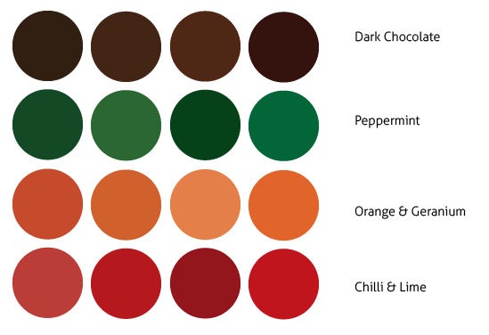
These were the colours that we chose for each flavour. We wanted to make sure that they were not the same as the colours for the brand identity so that there was a clear divide. They are all bright but they are a sincere and sophisticated hue of the chosen colour so that they are clear for printing.
While Emily was producing the packaging designs with the colours for the flavours, I decided that I would come up with all of the body copy that would be on the packaging for each flavour.
 |
| Planning Body Copy |
 |
| Body Copy applied to the Packaging |
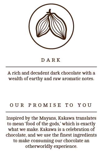
From my written descriptions, I typed them up and added them to the sections that Emily had left on the packaging. I was really happy with the way that my copywriting has been used on the packaging as they really suit the luxury sophistication of the brand. It comes across as classy and considered which is exactly what I wanted to come across through the wording of the descriptions.
Chocolate Box Nets
Following on from the packaging net that we had established, I printed off a copy of the net and made a mock up to scale to make sure that the net worked and that it would fit the size of the chocolate bar that we are using in it.
 |
| Mock Up Chocolate Bar Packaging |
 |
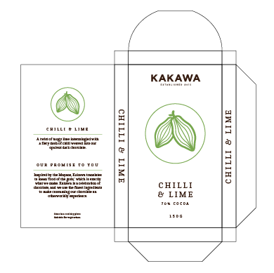
| Finished Chocolate Box Nets |
I am really happy with the way that the packaging looks as it does give the impression of being a high-end product which is what we wanted to achieve. Also, it looks a lot different to anything that I have helped produce before which is great because it gives a different element to work that I can produce.
Gift Sets Packaging
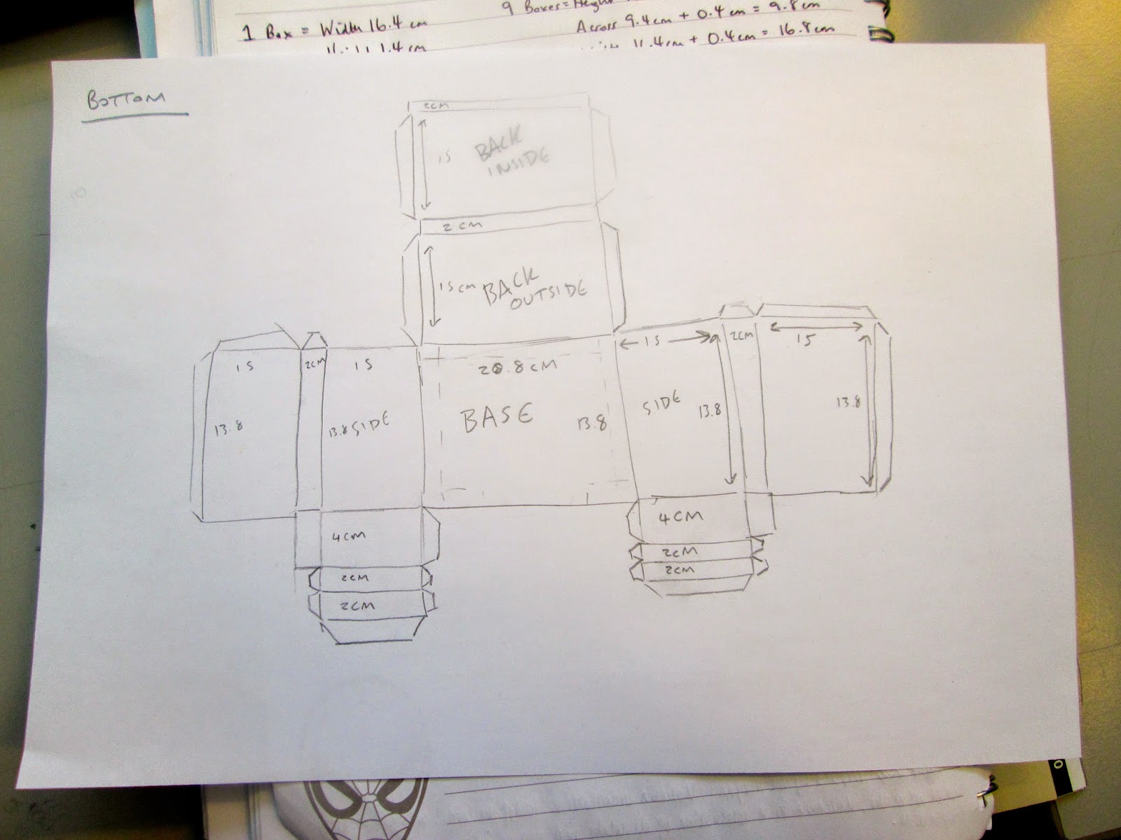
From the sketches that we had done earlier, we decided to try and produce a net for the packaging that we wanted for our flavoured chocolate gift set and our plain chocolate gift set.
 |
| Original Packaging Design Net for Flavoured Chocolate |
The packaging we had originally drawn was of a box which had a lid that you would be able to slide on and off. I thought it would be good to have an open top and side so that the consumer would be able to see the different chocolate flavours based on the packaging without having to empty the box out. Emily really wanted to do the packaging so that it doubled up on itself so the sides were very thick.
 |
| Original Net Tester Mock Up |
 |
| Simpler Net Planning |
We went back to the drawing board to make the net simpler and more streamlined so that it would actually fit properly.
 |
| Tester for Simpler Boxes |
 |
| Plain Chocolate 3 Gift Set Box |
Moving on from this, we made a net plan for a 3 bar gift set which would have the bars of chocolate next to each other instead of on top of each other.
 |
| 3 Bar Tester Mock Up |
 |
| Both Gift Set Testers Together |
Together, the boxes are very different in size and appearance yet this means that there is a distinctive personality within the brand as well as the types of the gift sets. I think that this is going to work very well when the actual boxes are made.
Board Pattern
For the actual packaging itself, we realised that the card alone would be quite flimsy to hold so many bars of chocolate so we decided to pad out the boxes using some mount board. However, there is no mount-board that is of a similar colour to what we need. We came up with the idea that we would have a small pile of mount board that we would wrap up in a patterned wrap and stick into the box, doubling up as a cover for the chocolate on the top as well. This would give an even more luxurious aesthetic to the gift sets.
I was tasked with producing a pattern that we could put on the wrap.
 |
| Pattern Experimentation |
 |
| Pattern Development |
 |
| Further Pattern Experimentation |
From the two most successful patterns, I went onto developing them by rotating the cocoa beans and making various shapes and orders for them. This gave a more experimental approach to the pattern which was great, yet the cocoa beans started to give the impression of being leaves rather than beans.
 |
| Chosen Pattern |
From this, we went back onto what I had originally produced and went for a simple all-facing forward layout as it was much more consistent and simplistic. We both agreed that allowed for a luxury aesthetic without going overboard.
Jar Labels
Following on from this, we realised that we needed to produce some labels for the jars that we wanted to use for some truffles and some hot chocolate powder. We measured the jars that we had bought so that we would be able to get an accurate size for a label.
 |
| Jars for Truffles and Hot Chocolate |
Emily had gone to have a look at vinyl for us to use for the brand and we decided that we wanted to use gold vinyl for the jars because this would reflect the brand colour scheme and would make a great contract against the brown contents of the jars which would make it readable.
 |
| Measurements for Jars and Box Wraps |
We measured the jars, as well as taking the measurements for the gift boxes to work out what size would be correct for the labels that we need to design.
 |
| Body Copy for Products |
Again, for these labels, I produced some new body copy for each product, keeping it the same consistency for the brand.
 |
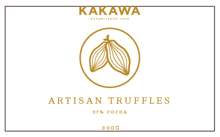
| Label for Truffles |
 |
| Sizing for Label |
Emily pointed out that the square around the label wouldn't actually be present so we could make the label the size of the area we had allowed for it, making it larger and more involved.
 |
| Cocoa Powder Label |
Following on from this, I produced a cocoa powder label in the same style except instead of making the label scaled to the area we had measured, we decided to have it the same as the Truffles so that there was consistency in the label sizes.
 |
| Vinyl Cut Sticker Labels |
When it came to printing, we found out that we would have to vinyl cut our labels in gold if we wanted them to work on a large scale. I have never produced anything vinyl cut before so this would be a new method of production. To do this, however, we had to sacrifice the front label by getting rid of the brand logo so that all the text would fit properly. The text itself came out beautifully and we couldn't have asked for a better finish.
 |
| Unsuccessful Jar Back |
Emily took the labels and re-sized the information, laying them out so they fitted the jars properly. Despite this, however, we soon found that the information that we wanted to stick onto the back of the jars was unreadable when put onto a dark background. We decided that we couldn't use this information and, decided to come up with an action plan to deal with this. The first thing we did was print a large logo in the gold vinyl to cover the back of the jars.
 |
| Changed Jar Labels |
We decided that it would be a good idea to produce a small label that could be attached around the top of the jar itself so that it would be visible and clear to read. With the jars being stuff that you can scoop out, it made sense to have just a single label that people would be able to read in a shop to know what the product is and whats in it.
Gift Box Wrap Arounds
Emily wanted to add the extra detail to the boxes by putting a wrap around the gift boxes so that the boxes themselves are properly closed.
 |
| Sizing of the Wraps |
Taking the measurements that we had written down earlier, I put the sizes of each section into Illustrator so that I knew how much room we had to work with.
 |
| Label Information |
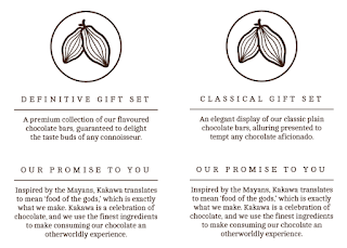
Following this, I produced the text for the back of the labels, making a description for each one and naming them 'the classic gift set' and 'the definitive gift set' so that there was a clear definition between the two different ones. From this, Emily took these elements to size them to fit the wrap properly and put them onto the off-white watercolour thick stock we felt gave a textured, luxury impression. The white would contrast the brown within the brand identity.
Foiling
The next thing we wanted to do was do the subtle foiling on the top of the gift set packaging.
 |
| Preparing Fabric Screen |
I havent done any screen-printing since last year so this was a good opportunity to get back to learning and remembering how to do it. Both Emily and myself shared cleaning, emulsioning and cleaning duties for the screen. Emily had printed and cut out the shape of the box lids so that it was readily prepared before we foiled the logo onto the top square.
 |
| Foiling Process |
Crafting
From the collateral we had made, we want onto printing everything out and crafting all of the packaging together.
 |
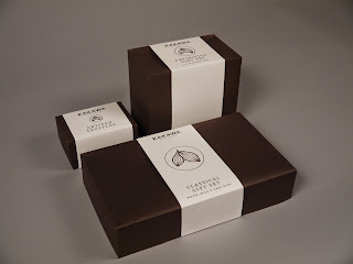
| Crafted Gift Box Packaging |
In regards to the boxes for the chocolate gift sets, Emily had printed and cut out the tops and bottoms of the boxes yet I was the one to craft them together, making sure that they fitted together.
 |
| Constructing Chocolate Bar Boxes |
 |
| Foil Wrap of Chocolate |
 |
| Packaging Inside Gift Boxes |
 |
| Using the Pattern for Box Insides |
 |
| Producing Box Wraps |
We produced the wraps for the gift boxes so that they all fit around the boxes, making them all succinct and consistent.
 |
| Jars for Truffles and Powder |
 |
| Truffles Box |
 |
| Finished Product & Packaging Range |
Final Products:
From this, we went onto photographing our work in the photography studio so that they would have some high quality images to back up the sophistication of the products themselves.
 |
| Range of Photographs from the Photography Slot |
 |
| Photoshop Editted Images |
To expand the brand itself as well as the brief, we both felt that it would be beneficial to do some mock ups for the brand to show how it would be applied in a contextual situation
 |
| Original Images |
These images were selected for the visual quality that would present the brand in as well as being representative aspects of a high end brand.
 |
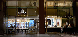
| Shop Exterior Mock Up |
I made the mock up very simply by getting rid of the existing logo and adding the Kakawa brand logo over the top creating the impression of a shop for the brand.
 |
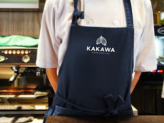
| Shop Uniform Mock Up |
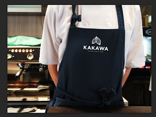
I produced this mock up by getting rid of the existing colour and saturating the area before adding the blue over the top of it and adding the logo, very similarly to how I had done it in the DBA brief to the chairs I made. It was great to be able to put something I had previously learnt to good use.

 |
| Shop Interior Chocolate Display Mock Up |
After getting rid of the original sign, I used the smudge tool to drag a small amount of gold on one side of the sign to the other so that the entire sign would be gold, thereby being in keeping with the colour scheme of the brand, before adding a logo onto the display.
 |
| Chocolate Display Labels Mock Up |
 |
| Finished Mock Ups |
I am very happy with the way that these mock ups have turned out as they look convincing and contextualise the brand fully in a real world setting. You can tell by looking at them how much better I have got at making mock ups, especially with the cutting out of the chocolate labels, suing the smudge tool to make the gold window sign and changing the colour of the apron by using the pen tool and a new layer. These are all things that I would never have been able to achieve at the beginning of the year
With the inclusion of the mock ups I had made, I made some submission boards for the module submission to demonstrate the journey of the brand and how I came to this conclusion.
I feel that the boards that I have produced shows a very condensed yet clear development of how the project progressed.
Overall, I am incredibly happy with the way that the project has turned out and the quality of the work that has been produced. It is definitely some of the best work that I have been involved in and quite possibly made as a designer. You can tell from the amount of detail into the project and how we have considered all aspects of the design that the quality is good and we have played to the strengths of each other to make the best work that we can. Even going as far as to include processes that I have never included within my practice before, like vinyl and foiling, which has improved the quality of the outcome.
Once Emily and myself managed to get round to doing the brief and making a proper start on it, we completely ran with it, putting all of our focus on it which made for a brief where we produced some work that we are proud of. Overall, the collaborative experience I had with Emily was one of the best collaborations I've had as we both were on the same wavelength throughout, bouncing ideas off of each other and splitting the workload evenly, working to each others strengths. We like very similar work but the way we look at the world and approach design is very different which helped build on the project because this meant that we could think about how other people view our work and make it better.













No comments:
Post a Comment