We have been given an area at random which needs a brand identity from scratch. We need to show how we can make a brand better, expanding it to show how it can do more than what it does.
From the ideas that I came up with, there were two that stood out to me as the ones which would be good possibilities if they were made in real life.
For the Crit, we needed to have some research or some initial ideas ready to show so that we could get some feedback based on what we had done so far. For this, I showed the 3 design sheets that I had produced at this point.
Within the crit, I showed the ideas that I had produced so far and both of the main ideas that I had got good feedback. On the boutique, I was told that I should take the idea and get it patented whereas the food waste idea they liked a bit more because they felt that I could play around with it making it a bit witty. Saying that, I was told by other members of the crit that the restaurant idea had already been done so SM suggested maybe looking at the corporate side of the idea, targeting the supermarkets for the waste they produce as it would make a big difference and you would be able to see the benefit straight away.
From the feedback that I got, I am tempted to go with the food waste idea, however, the fact that it may have already been done before has put me off a bit so I decided to go with the swap shop boutique. Plus, I have never produce a brand identity or ideas for a clothing shop so this would be something different for me to work on.
I had a look at pre-existing vintage/charity shops and clothes swap events to see what it would entail for me to consider for my brand. What struck me was how an event and a shop would come across as being cluttered and overbearing because you could tell it needed more time and consideration put into the approach and appearance of the clothing available. I knew that, if I wanted people to use my swapping brand, I would need to approach it from the angle of being a one-off boutique which was specialist and professional.
To start with, I went onto thinking of some initial ideas and settling on a brand name: Renew. Renew means to restore or replenish as well as to re-establish, revive or recover something. I felt that this was a name that was straight-forward and explained the concept of the store within the title.
 |
| Logo Initial Designs and Brand Strategy |
The most difficult thing about trying to produce a logo idea was the need to be able to incorporate the concept of the swap shop alongside the high fashion clothing brand identity. When I was thinking about the interchangeability of the clothing, it made me think of the clothes hangers that the clothes would be displayed on within a shop and how one piece would be taken off and one added on. From this, I tried to visually show or incorporate the clothing hanger into the brand logo.
As well as initial designs, I brainstormed ways that my brand could engage with people, such as collaborating with other established stores to encourage other consumers to swap clothes as well as maybe hold store events, such as a swap fashion week or specific event swap days, like fancy dress at halloween for example. Plus, I brainstormed stuff that would be relevant to my brand, like producing some guidelines, clothing labels and hangers as well as proposing a store interior and exterior.
 |
| Typeface Development |
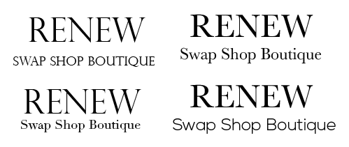
I started at looking at typefaces for the brand identity, using a mixture of sans serif and serif fonts. I was really struggling to choose a font because I liked the idea of using a traditional sans serif to go with the boutique and fashion feel however, I felt that a sans serif would go well with the concept of having something new from the old.
Whilst I continue developing the brand identity for the brand, I am going to continue with a serif font as I feel that the logo image itself well help in my overall typeface decision further on into development.
 |
| Logo Design Development |
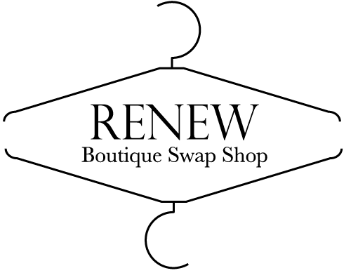
The next thing I did was start developing some of the logo initial ideas that I had produced and played with them in a digital manner. I started off using just one hanger, using it as a simple image alongside the name however I felt that this was lacking. I decided to use the hanger as a border for the text by having two reflecting hangers, which I soon developed by morphing them together into one shape. This gave a really nice shape that is reminiscent of a traditional boutique shop whilst also representing the constant cycle of the clothes.
 |
| Colour Scheme |
 |
| Colour Addition |
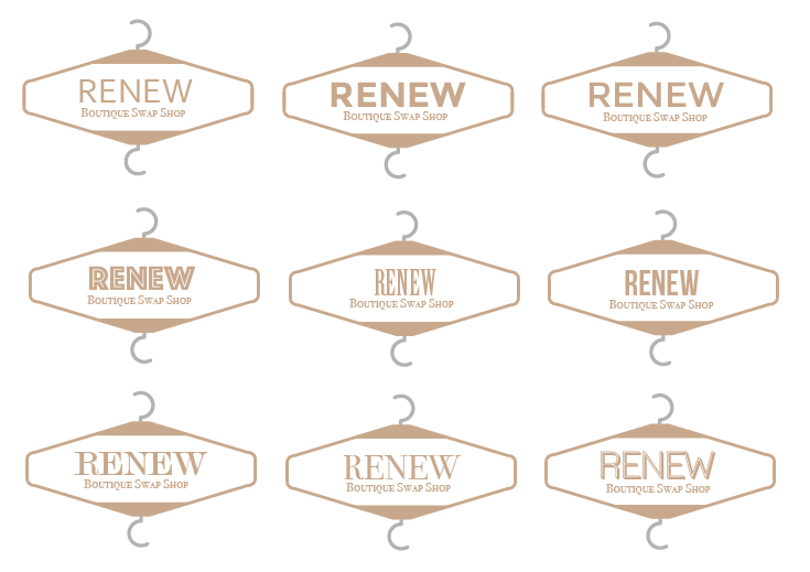
I went onto developing the chosen logo by adding colour reminiscent of a clothes hanger, working with a light brown and a soft grey, changing the thickness of the lines and adding colour to the text as well. This changed the dynamic of the logo as it made it much more softer and the colour choices made the logo reflect more on the boutique aspect of the brand rather than making it seem like it has anything to do with recycling, giving off a traditional shop feel.
 |
| Typefaces |
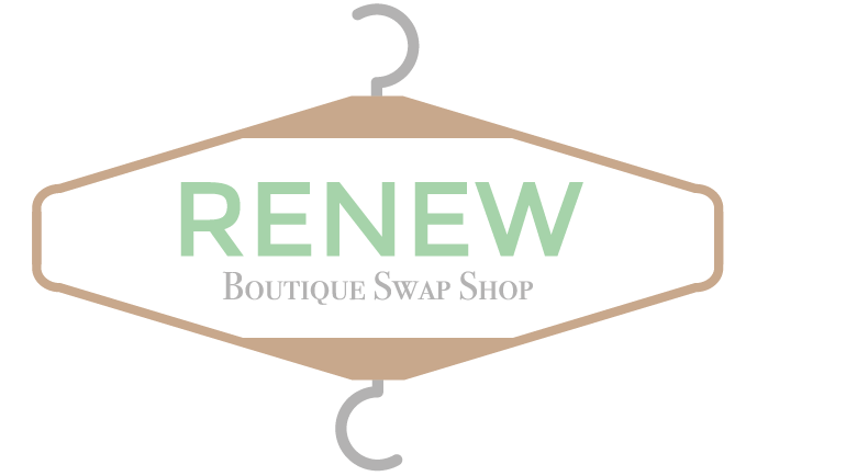
Using the colouration, I went back to looking at typefaces as the use of the light brown colour made for the logo looking quite soft. I felt that the typeface 'Bodoni Small Caps' made for a smart, concise tag-line font as it was quite formal and traditional. With the use of this, I felt that I would go for a sans serif for the header font so, by having a mix of the two, you can see the mixture of the old turning into new. I felt that 'Monserrat Regular' was thick enough to stand out without being bold.
 |
| Use of Green Colour |
I decided that it would be ideal to highlight the name of the brand within the logo because, at this point, it hasn't stood out compared to the rest of the logo, when it really should as it is the name of the brand. I did it in a soft pastel green so that it was reflective of the context of recycling, however, I decided to apply this to a piece of design work for the brand so that it would work properly.
I felt that, to be able to contextualise and explain the concept of the brand identity for the clients, I designed to do some design work to show how the boutique would operate. I felt that this would be done through items, like clothes hangers, clothes tags, bags and a contextual shop design.
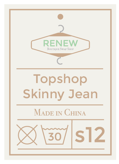
I felt that the main piece of design I should do for the brand itself to contextualise the brand would be a clothing label. This is simply because this would be used on the products themselves so it would make a lot of sense to include this within my collateral.
 |
| Development of Clothing Label |
I decided that I would have important information on the clothing label in regards to what the item of clothing was, where it was from, the size of the garment and how it could be washed. I felt that this way, it would orienteer the potential swapper as to the history of the garment and give a trustworthy, reliable approach to the concept. I laid this out in a structured manner so that each piece of information is clearly and carefully set out from the rest of the information, thereby there would be no mixing up or misunderstanding. The content was written in a darker brown to the background of the label for readability, however, I felt that the green colouration was washed out.
 |
| Revised Logo |
I felt that the green on the logo was getting lost within the clothing tag, making it difficult to read, so I decided to change the header font colour to a dark brown so that it is easier to read.
 |
| Clothing Label |
Instantly, the use of the dark brown rather than the green made for a much more readable tag. I realised that it would make more sense for the label to have the amount of times the clothing garment had been swapped as well so that it was showing the concept in action.
 |
| In-store Design Collateral |
To illustrate how the clothes would be shown in store to the swappers, I decided to illustrate the garment on a branded hanger so that this would show to the client how the products would be present. It was important for the clothes to be present as if they were new so that it comes across to the swappers like it would be acquiring a new piece of clothing. It was important for the swappers to get the same feeling from shopping as they do swapping which I think will be aided from this presentation of product.
 |
| Store Front Realised |
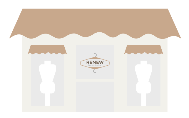
To be able to show and explain the concept, I felt that it was necessary to show what the boutique would look like, with a window sticker on the door and mannequins in the window like a normal fashion store. I would imagine for the store to have a canvas top to give a softness to the store and the mannequins in the store front would be dressed in a selection of the swapped clothes available.
 |
| Explanative Illustration |
To explain the idea itself, I made an illustrative visual so that it would be more explanative of the concept. I showed a pair of normal jeans and then a pair of jeans hung up on a branded hanger so as to show the transition between having one item being swapped for another. The arrows are showing the cycle of which this can go on for, showing how this is continuous and the cycle of re-using. I felt that this illustration made the point really clear and easy- to-understanding.
 |
| Event Tickets |
The most important thing for the brand would be to encourage people to get involved with the message and intention behind the brand, therefore I felt that it would be good to organise some possible in-store events and activities that could be done to get people actively involved. For this, I felt that this would be the best through having a fashion show that everyone could get involved with but making it special through having tickets, giving it an exclusive feel.
 |
| Reusable Tote Bags |
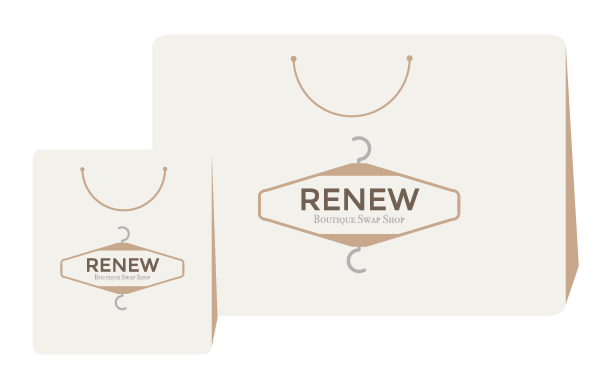
To reflect the shopping experience as well as the re-usable nature of the brand concept, I felt that it would be ideal to have tote bags that people would use when taking their swapped garments to and from the shop. It would be a great reflection on the store whilst, at the same time, appearing like it is part of the shopping experience.
I made design boards for the PDF to present and explain my brand concept, with the illustrations for the contextualisation of the brand being the main focus of the boards.
I was very happy with the way that I have made my boards are consistent throughout, using small points of information at the bottom to discuss the concept and aspects of the brand. I tried to make each board relevant and I tried to not repeat information. The illustrations perhaps don't give off as much of a professional aesthetic as photoshop mock ups would but I believe that they help put across the tone of voice of the brand and illustrates the brand much more coherently then if I used a mash-up of random, different photographs with the logo put onto it. This way the identity for the brand is the main focus.
Despite this, I felt that it was necessary to include a little bit about the brand guidelines for the brand alongside this information as this was lacking in the current design boards and this was the main aspect of the brief to have a fulfilled brand.
I felt that I had put a lot of thought into the concept of my brand and how it would work in real life, making it a strong concept. I was excited by the brief from the start and knew straight away that I wanted to get involved in it. I don't think I will win the brief but I was happy just to take part as I enjoyed doing it so much as the thought process and inception of brands is what I like doing.
From this, we then had to present our concept to SM by giving a presentation. I decided to go with the boards I had made rather than making a separate presentation because I felt that the boards were self explanatory.
 |
| My Winning Chocolate Orange! |
When presenting, I was very worried that I didn't do my brand justice because I was so nervous that I was tripping up over myself trying to explain everything so in a way I was greatful that I had left it as boards with all of the information along the bottom.
We were told that there would be a winner for each of the 6 categories and I was picked for the recycling topic. I was genuinely shocked as I didn't think I could win anything or have my work recognised by a creative before, especially as I feel like I don't compare next to my peers. It means all the more to me because this is what I like to do, the thinking behind a brand and the way it works.
I was given feedback by SM as they said that they liked that my boards went through my concept succinctly in a journey style where you could see how it worked. They also liked how I had done my illustrations to show the brief as it was totally in keeping with the voice and tone of the brand instead of just putting a logo onto an object.
For this, I won a chocolate orange and an induction into the photography suite at Duke Studios. It's such an amazing opportunity and I am very very thankful, especially as this will give me an invaluable in-site into a working design studio.
I made some submission boards for the module submission to demonstrate the journey of the brand and how I came to this conclusion.
I feel that the boards that I have produced shows a very condensed yet clear development of how the project progressed.




No comments:
Post a Comment